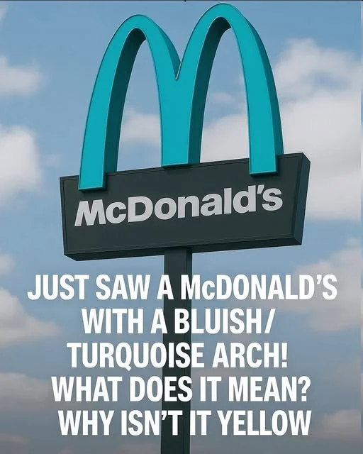
What Does a Turquoise McDonald’s Arch Mean? The Surprising Story Behind the Unusual Sign
Most people recognize McDonald’s instantly by its famous golden arches. The bright yellow “M” has become one of the most recognizable symbols in the world, appearing on restaurants, roadside signs, packaging, and advertisements.
So imagine driving through a town and suddenly noticing a McDonald’s sign with turquoise or blue-green arches instead of the familiar golden yellow. At first, you might wonder whether the restaurant belongs to a different company, whether the sign is part of a special promotion, or whether there is a hidden meaning behind the unusual color.
The good news is that a turquoise McDonald’s arch does not automatically indicate a different menu, a special restaurant category, or a change in ownership. The explanation usually involves the location, local design decisions, or a particular sign installation.
Understanding why some McDonald’s signs look different reveals an interesting side of the relationship between global brands, architecture, and local communities.
Why Are McDonald’s Arches Usually Yellow?
The golden arches are a central part of McDonald’s visual identity.
The familiar shape developed from the architectural arches used in early McDonald’s restaurant designs. Over time, the arches became more than a decorative feature: they evolved into a distinctive symbol associated with the company.
Their bright yellow color helps the sign stand out against surrounding buildings, roads, and landscapes.
Yellow is often associated with warmth, visibility, and energy. Combined with the restaurant’s branding, it creates a recognizable image that customers can identify from a distance.
The golden arches have become so familiar that even small changes to their appearance can attract attention.
That is why a turquoise version can seem unusual, especially to someone who has only seen the traditional yellow design.
What Does a Turquoise McDonald’s Arch Mean?
There is no universal meaning attached to turquoise McDonald’s arches.
A turquoise sign does not automatically mean that the restaurant serves healthier food, belongs to a premium restaurant category, or operates under a different business model.
Instead, unusual arch colors can result from local architectural requirements, aesthetic preferences, or other site-specific decisions.
The exact explanation depends on the restaurant’s location and the sign itself.
1. Local Planning and Design Requirements
One possible explanation is that local authorities or property owners have restrictions on exterior signage.
In certain historic districts, scenic areas, or communities with strict architectural guidelines, businesses may be required to use colors that fit the surrounding environment.
A company opening a restaurant in such an area may need to adapt its exterior design to comply with local rules.
These requirements can affect building materials, lighting, sign dimensions, and colors.
However, it is important not to assume that every turquoise McDonald’s sign exists because of a government regulation. The specific reason must be established for the individual location.
2. Architectural Harmony
Some businesses adjust their exterior appearance to complement nearby buildings and landscapes.
A turquoise sign may be chosen because it works better with the surrounding architecture, local design preferences, or the overall appearance of a property.
For example, a restaurant in an area with distinctive buildings may use a less conventional color to create a more harmonious exterior.
Such decisions can help a business fit into its surroundings while remaining recognizable.
Again, the color alone does not establish why a particular sign was designed that way.